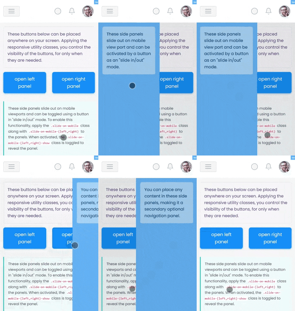
These buttons below can be placed anywhere on your screen. Applying the responsive utility classes, you
control the visibility of the buttons, for only when they are needed.
These side panels slide out on mobile viewports and can be toggled using a button in "slide in/out" mode.
To enable this functionality, apply the .slide-on-mobile class along with
.slide-on-mobile-{left,right} to the panels.
When activated, the .slide-on-mobile-{left,right}-show class is toggled to reveal the panel.
A backdrop is automatically inserted right after the closing tag of the .slide-on-mobile
container. Typically, this slide
panel is paired with .layout-trimmed and .set-nav-minified for a clean and
streamlined appearance.